12:49:17
Let's Design Tomorrow
Up Next
Up Next
Scroll Down
Up Next
Beirut

Client
Beirut Streetwear
Project
Reborn with Style
Services
Brand Strategy
Brand Identity
Brand Content
Industry
Fashion
Year
2024
Uniting Nation
Around
One Purpose
Beirut, a premium streetwear fashion brand rooted in Lebanon's resilient history, encapsulating the city's unbeatable spirit through cycles of destruction and reconstruction.
We collaborated to target the global urban youth seeking a connection beyond fashion, drowning to a lifestyle reflecting resilience and style.
Intertwining Beirut Streetwear's narrative into every aspect of its identity. From crafting a compelling visual language to designing a strategic marketing roadmap, our comprehensive approach ensures the brand becomes more than just fashion—it's a cultural emblem, a symbol of strength and style.
Empowering Youth
The power of fashion as a canvas for social change
Problem
Lebanon's political landscape is entrenched in corruption, sectarian divides, and the dominance of traditional political parties since the civil war. This has led to widespread disillusionment among the youth, who feel marginalized and voiceless in the face of systemic oppression.
Solution
We promoted secularism and unity by rejecting divisive rhetoric and fostering community. Through bold messaging and advocacy, we inspired a new generation of activists to challenge oppression and rebuild Lebanon.


From Destruction To Design
An architectural logo documenting a nation's story
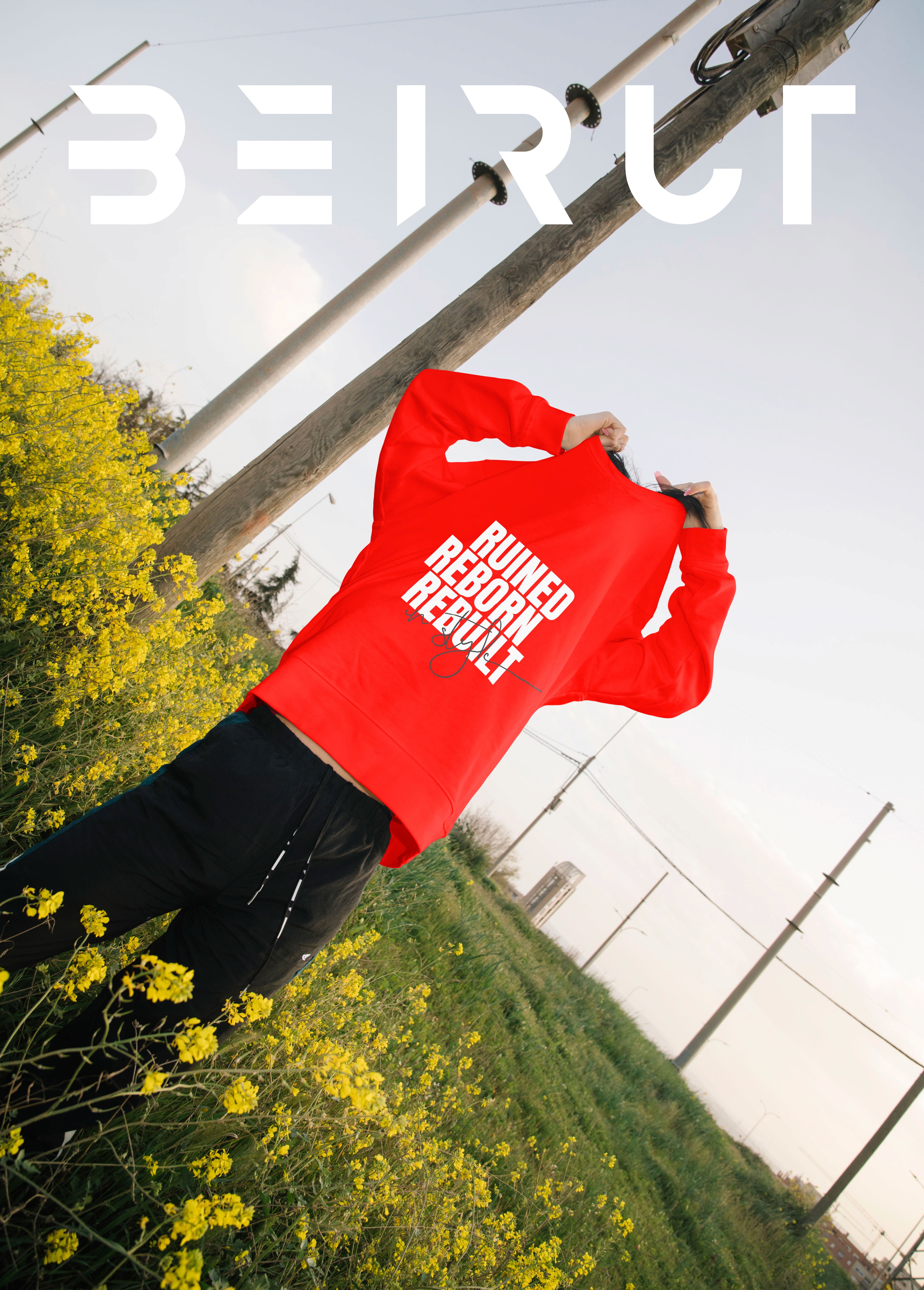
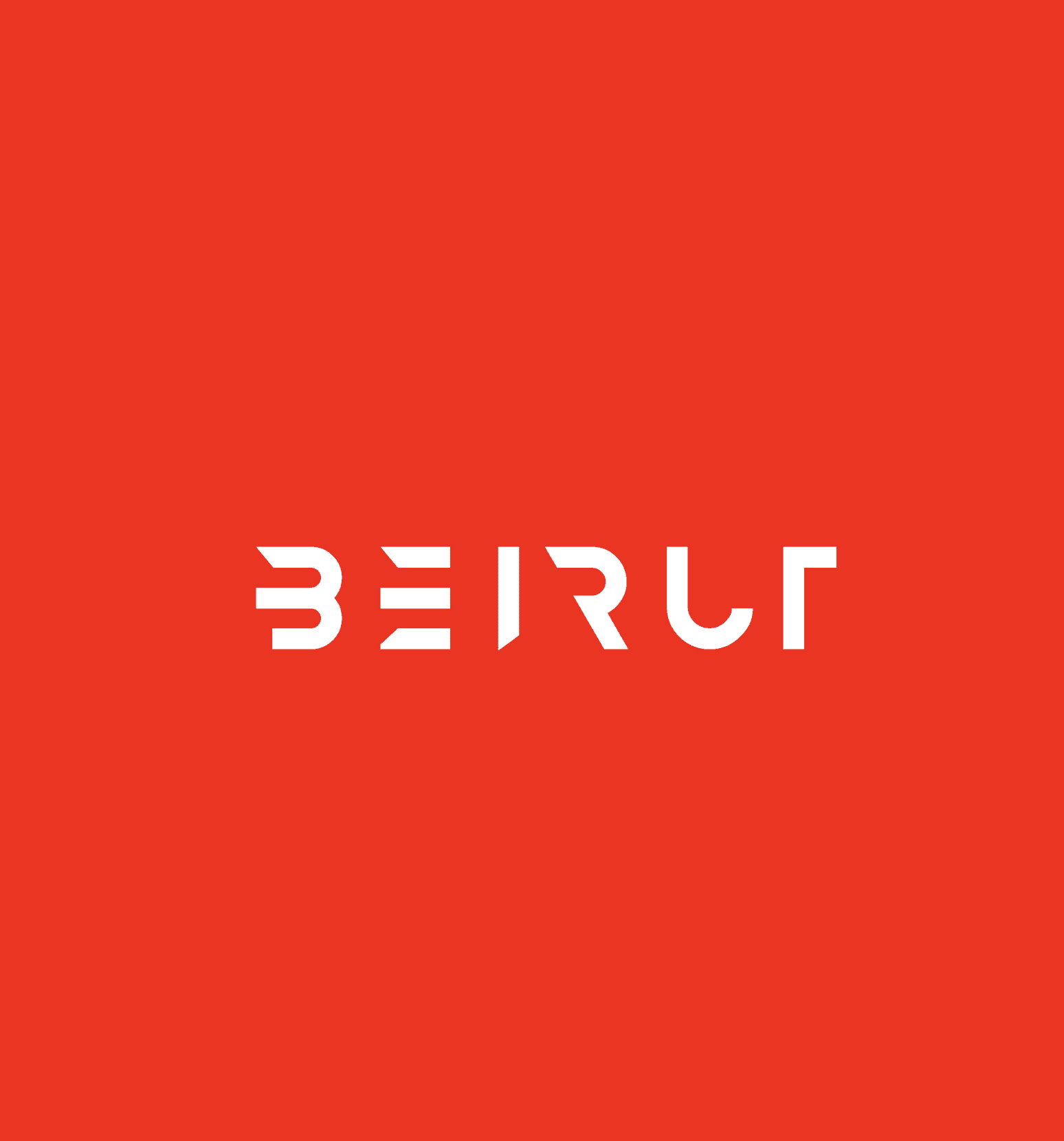
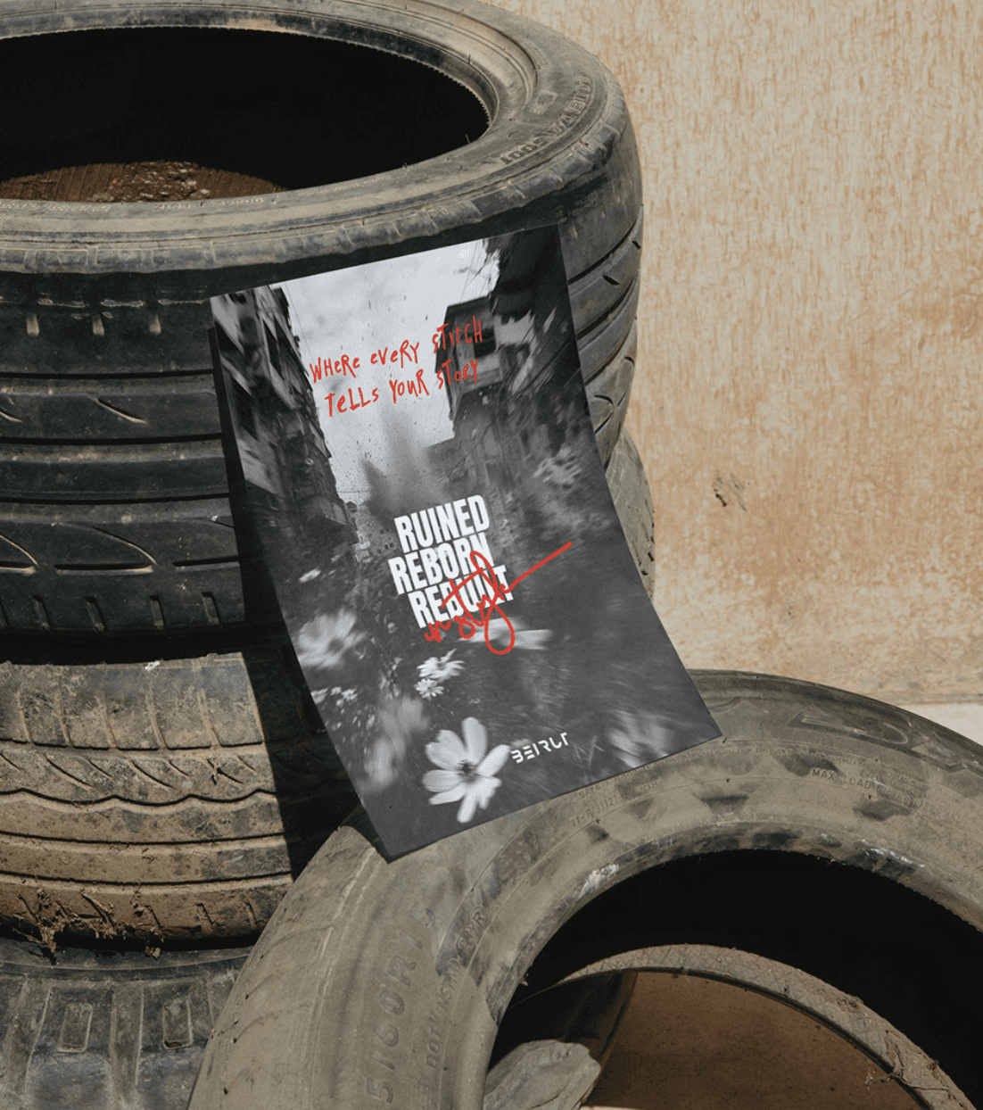
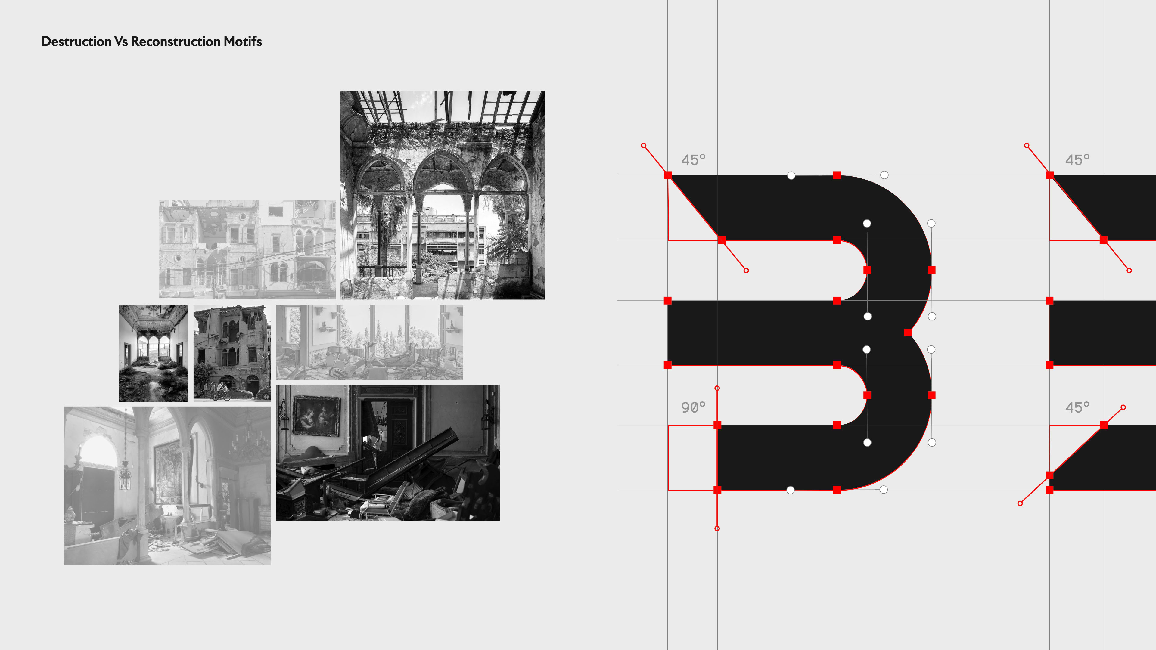
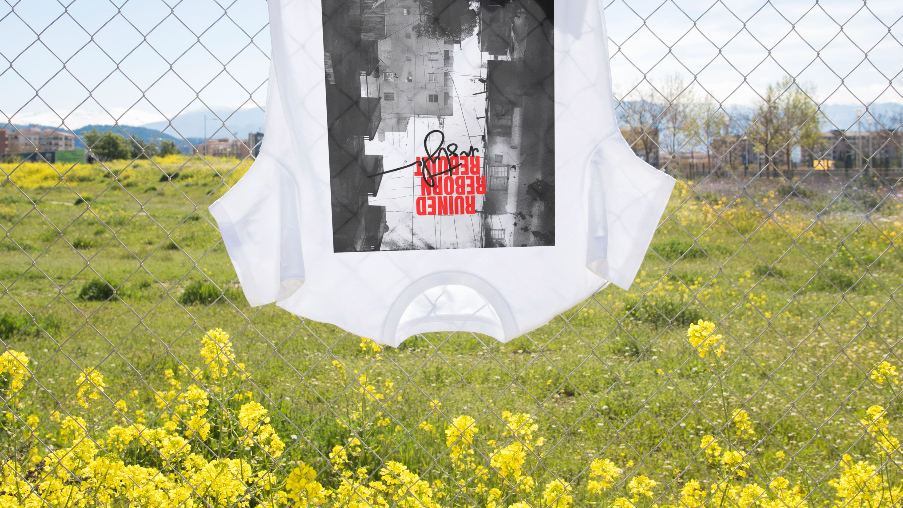
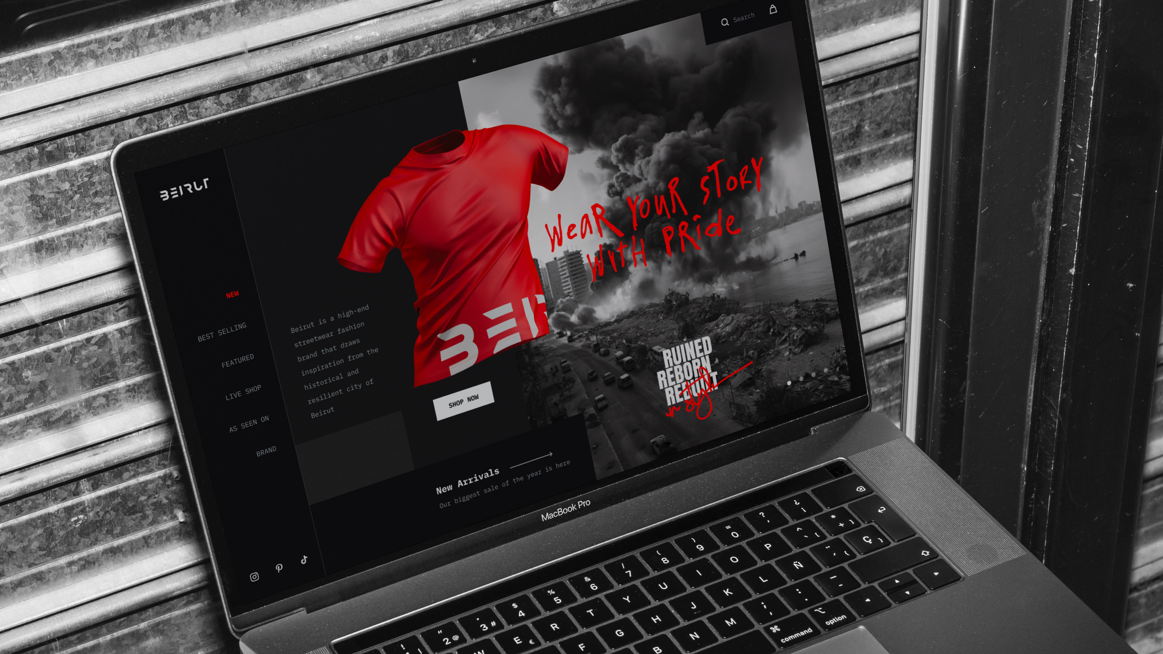
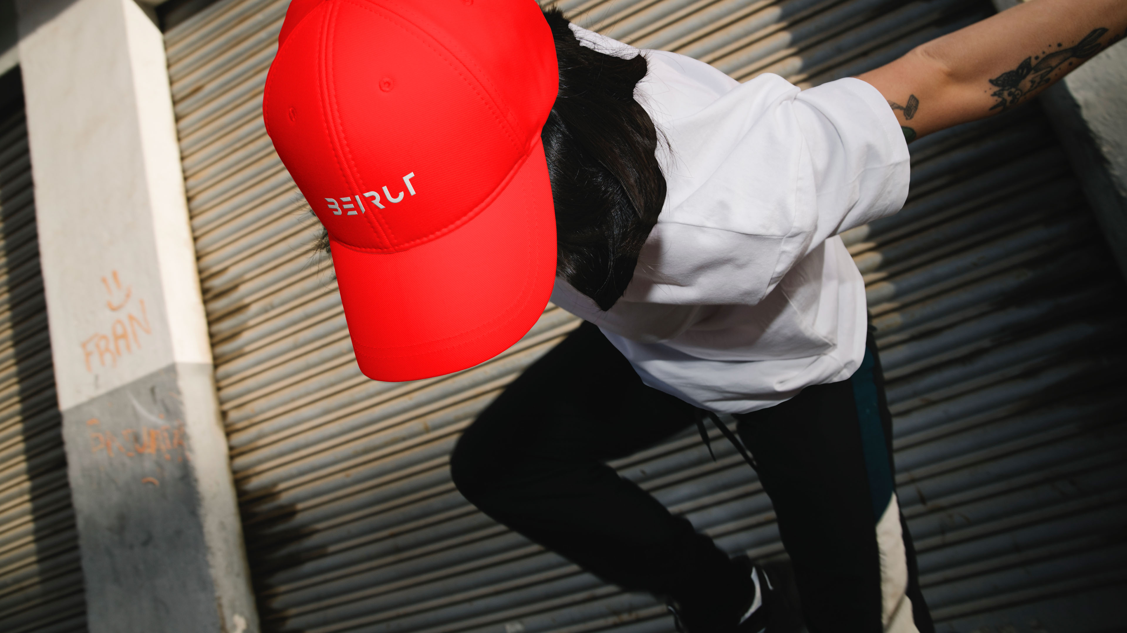
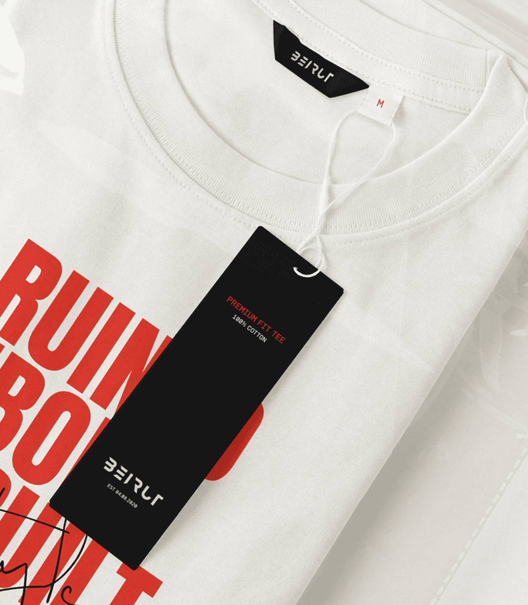
The Beirut logo epitomizes the brand's core message—Ruined, Reborn, Rebuilt in Style. Crafted with irregular edges, the letters evoke a sense of destruction and resilience, embodying a distressed and rebuilt aesthetic.
The logotype complements the brand's overall message by exuding strength and confidence. Additionally, the logo subtly incorporates arches and columns, symbolizing Beirut's architectural resilience.


Chaos in Strokes
Turbulent typography for a rebellious narrative
The objective was clear: find a font that echoed the raw, untamed energy of the brand's journey from ruins to a stylish rebirth.
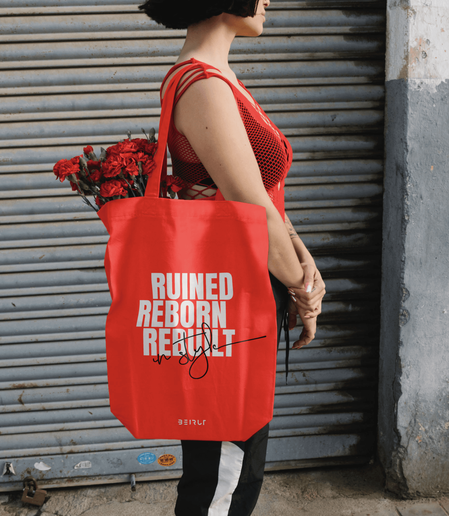
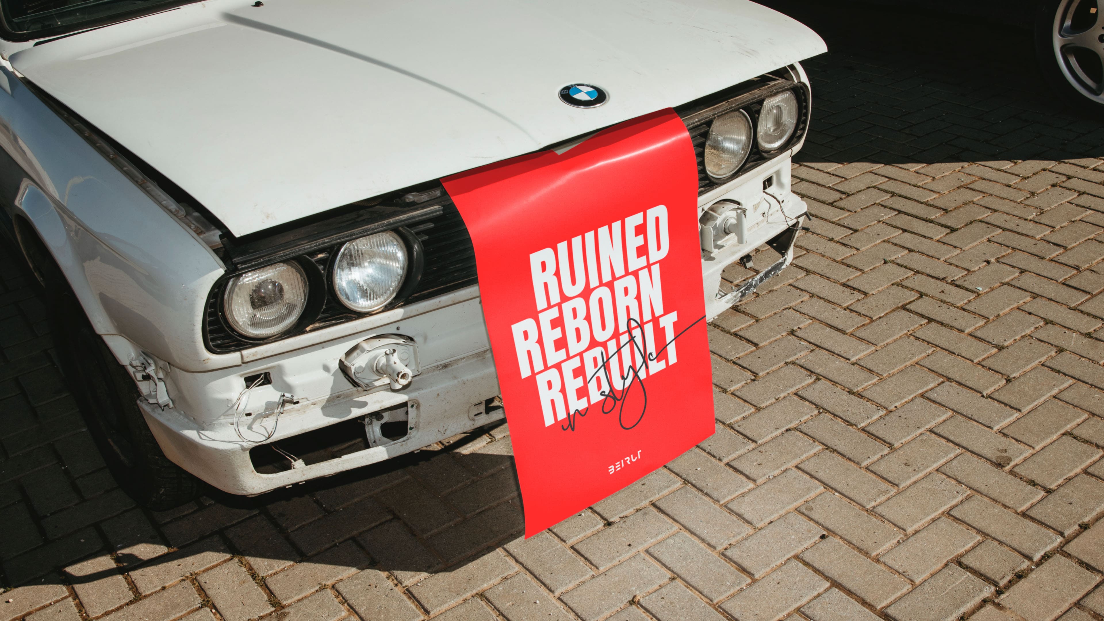
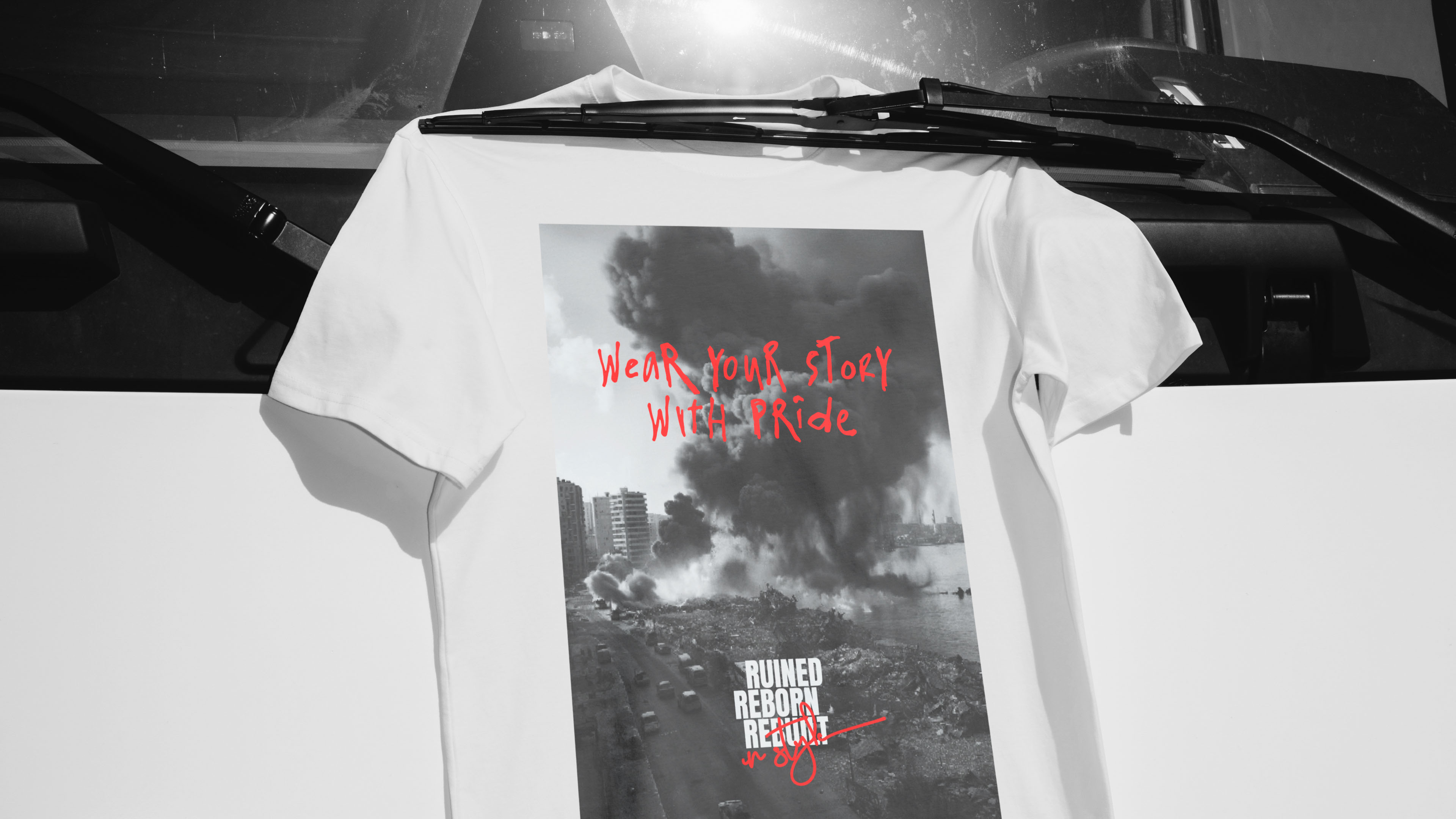
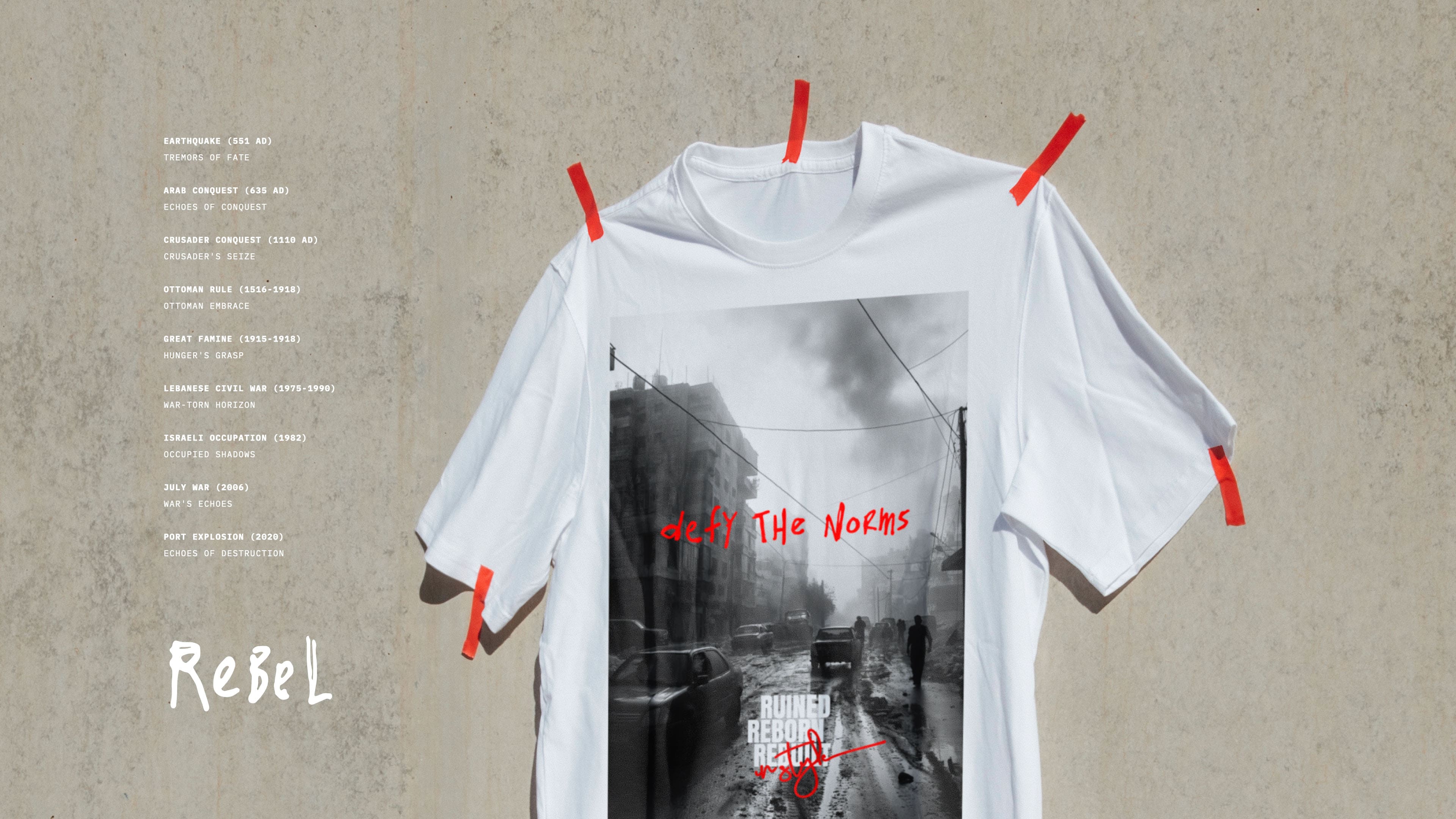
The solution lay in a wonderfully wild and turbulent handwriting font, scrawled with a pen, featuring an erratic switch between uppercase and lowercase letters. This typography became a visual manifestation of the brand's essence —ruined, reborn, and rebuilt in style.
Strategically implemented across marketing materials and digital assets, the font not only enhanced brand recognition but also engaged the audience, encouraging exploration of Beirut brand's rebellious and transformative story.


Voice of Rebellion
Tone of Voice
Bold. Authentic. Empowering
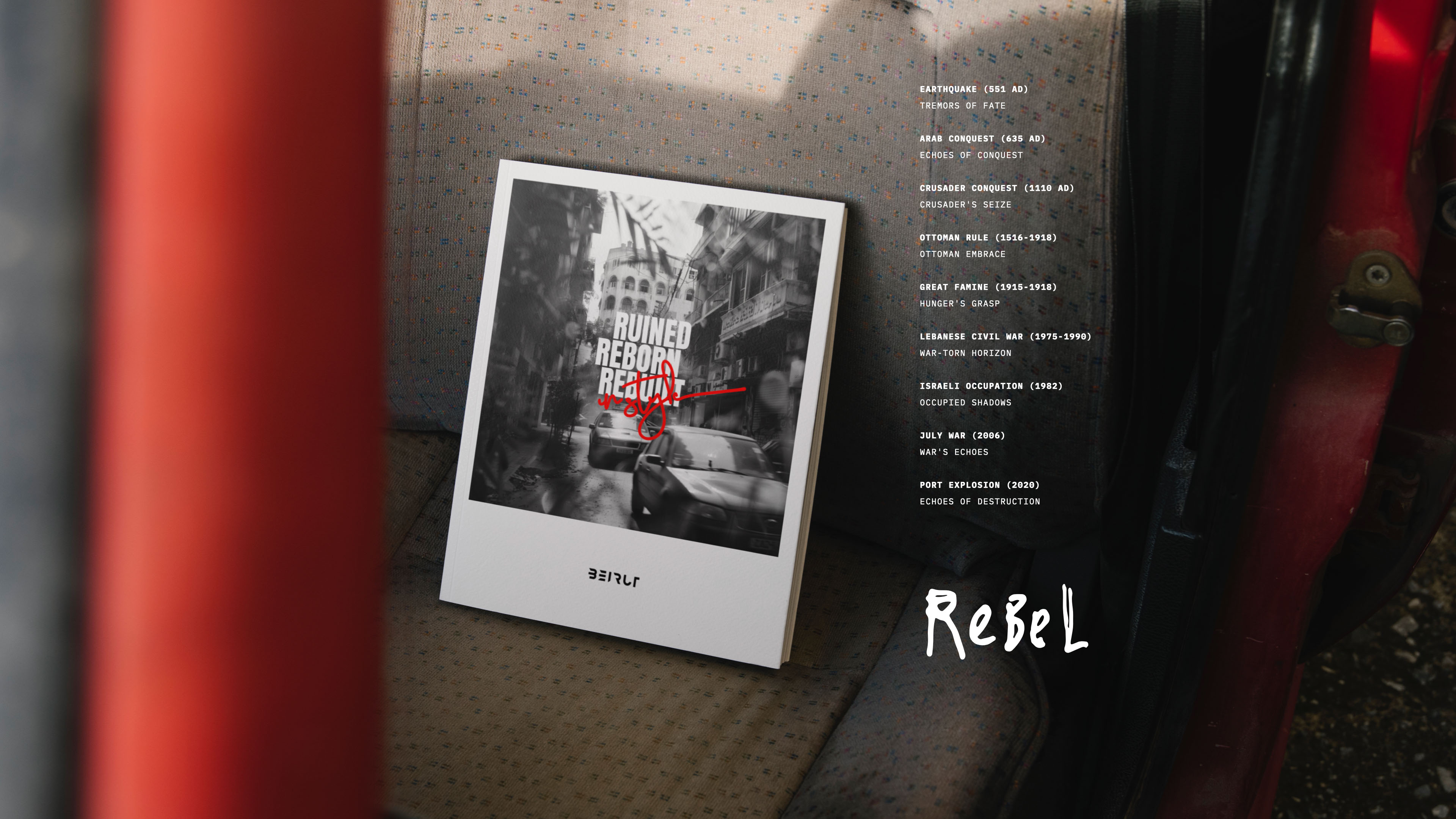
The tone of voice and communication strategy are carefully crafted to resonate with the brand's narrative of resilience, rebellion, and stylish rebirth. The language employed is bold, confident, and empowering, echoing the spirit of a community that has faced challenges head-on. The tone reflects a sense of authenticity, weaving a story that connects with the audience on a personal level.
Through a dynamic mix of assertive and inspiring language, the communication seeks to evoke emotions, encouraging individuals to embrace their own narratives of overcoming obstacles. This deliberate choice of tone creates a distinctive and memorable brand identity, ensuring that every piece of communication, whether it be in marketing materials, social media, or customer interactions, aligns with the empowering essence of Beirut Fashion Brand.


Up Next
Up Next
Scroll Down
Up Next
Beirut

Client
Beirut Streetwear
Project
Reborn with Style
Services
Brand Strategy
Brand Identity
Brand Content
Industry
Fashion
Year
2024
Uniting Nation
Around
One Purpose
Beirut, a premium streetwear fashion brand rooted in Lebanon's resilient history, encapsulating the city's unbeatable spirit through cycles of destruction and reconstruction.
We collaborated to target the global urban youth seeking a connection beyond fashion, drowning to a lifestyle reflecting resilience and style.
Intertwining Beirut Streetwear's narrative into every aspect of its identity. From crafting a compelling visual language to designing a strategic marketing roadmap, our comprehensive approach ensures the brand becomes more than just fashion—it's a cultural emblem, a symbol of strength and style.


Empowering Youth
The power of fashion as a canvas for social change
Problem
Lebanon's political landscape is entrenched in corruption, sectarian divides, and the dominance of traditional political parties since the civil war. This has led to widespread disillusionment among the youth, who feel marginalized and voiceless in the face of systemic oppression.
Solution
We promoted secularism and unity by rejecting divisive rhetoric and fostering community. Through bold messaging and advocacy, we inspired a new generation of activists to challenge oppression and rebuild Lebanon.


From Destruction To Design
An architectural logo documenting a nation's story
The Beirut logo epitomizes the brand's core message—Ruined, Reborn, Rebuilt in Style. Crafted with irregular edges, the letters evoke a sense of destruction and resilience, embodying a distressed and rebuilt aesthetic.
The logotype complements the brand's overall message by exuding strength and confidence. Additionally, the logo subtly incorporates arches and columns, symbolizing Beirut's architectural resilience.


Chaos in Strokes
Turbulent typography for a rebellious narrative
The objective was clear: find a font that echoed the raw, untamed energy of the brand's journey from ruins to a stylish rebirth.
The solution lay in a wonderfully wild and turbulent handwriting font, scrawled with a pen, featuring an erratic switch between uppercase and lowercase letters. This typography became a visual manifestation of the brand's essence —ruined, reborn, and rebuilt in style.
Strategically implemented across marketing materials and digital assets, the font not only enhanced brand recognition but also engaged the audience, encouraging exploration of Beirut brand's rebellious and transformative story.


Voice of Rebellion
Tone of Voice
Bold. Authentic. Empowering
The tone of voice and communication strategy are carefully crafted to resonate with the brand's narrative of resilience, rebellion, and stylish rebirth. The language employed is bold, confident, and empowering, echoing the spirit of a community that has faced challenges head-on. The tone reflects a sense of authenticity, weaving a story that connects with the audience on a personal level. Through a dynamic mix of assertive and
inspiring language, the communication seeks to evoke emotions, encouraging individuals to embrace their own narratives of overcoming obstacles. This deliberate choice of tone creates a distinctive and memorable brand identity, ensuring that every piece of communication, whether it be in marketing materials, social media, or customer interactions, aligns with the empowering essence of Beirut Fashion Brand.


Uniting Nation
Around
One Purpose
Beirut, a premium streetwear fashion brand rooted in Lebanon's resilient history, encapsulating the city's unbeatable spirit through cycles of destruction and reconstruction.
We collaborated to target the global urban youth seeking a connection beyond fashion, drowning to a lifestyle reflecting resilience and style.
Intertwining Beirut Streetwear's narrative into every aspect of its identity. From crafting a compelling visual language to designing a strategic marketing roadmap, our comprehensive approach ensures the brand becomes more than just fashion—it's a cultural emblem, a symbol of strength and style.


Empowering Youth
The power of fashion as a canvas for social change
Problem
Lebanon's political landscape is entrenched in corruption, sectarian divides, and the dominance of traditional political parties since the civil war. This has led to widespread disillusionment among the youth, who feel marginalized and voiceless in the face of systemic oppression.
Solution
We promoted secularism and unity by rejecting divisive rhetoric and fostering community. Through bold messaging and advocacy, we inspired a new generation of activists to challenge oppression and rebuild Lebanon.


From Destruction To Design
An architectural logo documenting a nation's story
The Beirut logo epitomizes the brand's core message—Ruined, Reborn, Rebuilt in Style. Crafted with irregular edges, the letters evoke a sense of destruction and resilience, embodying a distressed and rebuilt aesthetic.
The logotype complements the brand's overall message by exuding strength and confidence. Additionally, the logo subtly incorporates arches and columns, symbolizing Beirut's architectural resilience.


Chaos in Strokes
Turbulent typography for a rebellious narrative
The objective was clear: find a font that echoed the raw, untamed energy of the brand's journey from ruins to a stylish rebirth.
The solution lay in a wonderfully wild and turbulent handwriting font, scrawled with a pen, featuring an erratic switch between uppercase and lowercase letters. This typography became a visual manifestation of the brand's essence —ruined, reborn, and rebuilt in style.
Strategically implemented across marketing materials and digital assets, the font not only enhanced brand recognition but also engaged the audience, encouraging exploration of Beirut brand's rebellious and transformative story.


Voice of Rebellion
Tone of Voice
Bold. Authentic. Empowering
The tone of voice and communication strategy are carefully crafted to resonate with the brand's narrative of resilience, rebellion, and stylish rebirth. The language employed is bold, confident, and empowering, echoing the spirit of a community that has faced challenges head-on. The tone reflects a sense of authenticity, weaving a story that connects with the audience on a personal level. Through a dynamic mix of assertive and
inspiring language, the communication seeks to evoke emotions, encouraging individuals to embrace their own narratives of overcoming obstacles. This deliberate choice of tone creates a distinctive and memorable brand identity, ensuring that every piece of communication, whether it be in marketing materials, social media, or customer interactions, aligns with the empowering essence of Beirut Fashion Brand.


12:49:17
. Let's Design Tomorrow
12:49:17
Let's Design Tomorrow
Up Next
Up Next
Scroll Down
Up Next
Beirut

Client
Beirut Streetwear
Project
Reborn with Style
Services
Brand Strategy
Brand Identity
Brand Content
Industry
Fashion
Year
2024
Uniting Nation
Around
One Purpose
Beirut, a premium streetwear fashion brand rooted in Lebanon's resilient history, encapsulating the city's unbeatable spirit through cycles of destruction and reconstruction.
We collaborated to target the global urban youth seeking a connection beyond fashion, drowning to a lifestyle reflecting resilience and style.
Intertwining Beirut Streetwear's narrative into every aspect of its identity. From crafting a compelling visual language to designing a strategic marketing roadmap, our comprehensive approach ensures the brand becomes more than just fashion—it's a cultural emblem, a symbol of strength and style.


Empowering Youth
The power of fashion as a canvas for social change
Problem
Lebanon's political landscape is entrenched in corruption, sectarian divides, and the dominance of traditional political parties since the civil war. This has led to widespread disillusionment among the youth, who feel marginalized and voiceless in the face of systemic oppression.
Solution
We promoted secularism and unity by rejecting divisive rhetoric and fostering community. Through bold messaging and advocacy, we inspired a new generation of activists to challenge oppression and rebuild Lebanon.


From Destruction To Design
An architectural logo documenting a nation's story
The Beirut logo epitomizes the brand's core message—Ruined, Reborn, Rebuilt in Style. Crafted with irregular edges, the letters evoke a sense of destruction and resilience, embodying a distressed and rebuilt aesthetic.
The logotype complements the brand's overall message by exuding strength and confidence. Additionally, the logo subtly incorporates arches and columns, symbolizing Beirut's architectural resilience.


Chaos in Strokes
Turbulent typography for a rebellious narrative
The objective was clear: find a font that echoed the raw, untamed energy of the brand's journey from ruins to a stylish rebirth.
The solution lay in a wonderfully wild and turbulent handwriting font, scrawled with a pen, featuring an erratic switch between uppercase and lowercase letters. This typography became a visual manifestation of the brand's essence —ruined, reborn, and rebuilt in style.
Strategically implemented across marketing materials and digital assets, the font not only enhanced brand recognition but also engaged the audience, encouraging exploration of Beirut brand's rebellious and transformative story.


Voice of Rebellion
Tone of Voice
Bold. Authentic. Empowering
The tone of voice and communication strategy are carefully crafted to resonate with the brand's narrative of resilience, rebellion, and stylish rebirth. The language employed is bold, confident, and empowering, echoing the spirit of a community that has faced challenges head-on. The tone reflects a sense of authenticity, weaving a story that connects with the audience on a personal level.
Through a dynamic mix of assertive and inspiring language, the communication seeks to evoke emotions, encouraging individuals to embrace their own narratives of overcoming obstacles. This deliberate choice of tone creates a distinctive and memorable brand identity, ensuring that every piece of communication, whether it be in marketing materials, social media, or customer interactions, aligns with the empowering essence of Beirut Fashion Brand.


Up Next
Up Next
Scroll Down
Up Next
Beirut

Client
Beirut Streetwear
Project
Reborn with Style
Services
Brand Strategy
Brand Identity
Brand Content
Industry
Fashion
Year
2024
Uniting Nation
Around
One Purpose
Beirut, a premium streetwear fashion brand rooted in Lebanon's resilient history, encapsulating the city's unbeatable spirit through cycles of destruction and reconstruction.
We collaborated to target the global urban youth seeking a connection beyond fashion, drowning to a lifestyle reflecting resilience and style.
Intertwining Beirut Streetwear's narrative into every aspect of its identity. From crafting a compelling visual language to designing a strategic marketing roadmap, our comprehensive approach ensures the brand becomes more than just fashion—it's a cultural emblem, a symbol of strength and style.


Empowering Youth
The power of fashion as a canvas for social change
Problem
Lebanon's political landscape is entrenched in corruption, sectarian divides, and the dominance of traditional political parties since the civil war. This has led to widespread disillusionment among the youth, who feel marginalized and voiceless in the face of systemic oppression.
Solution
We promoted secularism and unity by rejecting divisive rhetoric and fostering community. Through bold messaging and advocacy, we inspired a new generation of activists to challenge oppression and rebuild Lebanon.


From Destruction To Design
An architectural logo documenting a nation's story
The Beirut logo epitomizes the brand's core message—Ruined, Reborn, Rebuilt in Style. Crafted with irregular edges, the letters evoke a sense of destruction and resilience, embodying a distressed and rebuilt aesthetic.
The logotype complements the brand's overall message by exuding strength and confidence. Additionally, the logo subtly incorporates arches and columns, symbolizing Beirut's architectural resilience.


Chaos in Strokes
Turbulent typography for a rebellious narrative
The objective was clear: find a font that echoed the raw, untamed energy of the brand's journey from ruins to a stylish rebirth.
The solution lay in a wonderfully wild and turbulent handwriting font, scrawled with a pen, featuring an erratic switch between uppercase and lowercase letters. This typography became a visual manifestation of the brand's essence —ruined, reborn, and rebuilt in style.
Strategically implemented across marketing materials and digital assets, the font not only enhanced brand recognition but also engaged the audience, encouraging exploration of Beirut brand's rebellious and transformative story.


Voice of Rebellion
Tone of Voice
Bold. Authentic. Empowering
The tone of voice and communication strategy are carefully crafted to resonate with the brand's narrative of resilience, rebellion, and stylish rebirth. The language employed is bold, confident, and empowering, echoing the spirit of a community that has faced challenges head-on. The tone reflects a sense of authenticity, weaving a story that connects with the audience on a personal level. Through a dynamic mix of assertive and
inspiring language, the communication seeks to evoke emotions, encouraging individuals to embrace their own narratives of overcoming obstacles. This deliberate choice of tone creates a distinctive and memorable brand identity, ensuring that every piece of communication, whether it be in marketing materials, social media, or customer interactions, aligns with the empowering essence of Beirut Fashion Brand.


Uniting Nation
Around
One Purpose
Beirut, a premium streetwear fashion brand rooted in Lebanon's resilient history, encapsulating the city's unbeatable spirit through cycles of destruction and reconstruction.
We collaborated to target the global urban youth seeking a connection beyond fashion, drowning to a lifestyle reflecting resilience and style.
Intertwining Beirut Streetwear's narrative into every aspect of its identity. From crafting a compelling visual language to designing a strategic marketing roadmap, our comprehensive approach ensures the brand becomes more than just fashion—it's a cultural emblem, a symbol of strength and style.


Empowering Youth
The power of fashion as a canvas for social change
Problem
Lebanon's political landscape is entrenched in corruption, sectarian divides, and the dominance of traditional political parties since the civil war. This has led to widespread disillusionment among the youth, who feel marginalized and voiceless in the face of systemic oppression.
Solution
We promoted secularism and unity by rejecting divisive rhetoric and fostering community. Through bold messaging and advocacy, we inspired a new generation of activists to challenge oppression and rebuild Lebanon.


From Destruction To Design
An architectural logo documenting a nation's story
The Beirut logo epitomizes the brand's core message—Ruined, Reborn, Rebuilt in Style. Crafted with irregular edges, the letters evoke a sense of destruction and resilience, embodying a distressed and rebuilt aesthetic.
The logotype complements the brand's overall message by exuding strength and confidence. Additionally, the logo subtly incorporates arches and columns, symbolizing Beirut's architectural resilience.


Chaos in Strokes
Turbulent typography for a rebellious narrative
The objective was clear: find a font that echoed the raw, untamed energy of the brand's journey from ruins to a stylish rebirth.
The solution lay in a wonderfully wild and turbulent handwriting font, scrawled with a pen, featuring an erratic switch between uppercase and lowercase letters. This typography became a visual manifestation of the brand's essence —ruined, reborn, and rebuilt in style.
Strategically implemented across marketing materials and digital assets, the font not only enhanced brand recognition but also engaged the audience, encouraging exploration of Beirut brand's rebellious and transformative story.


Voice of Rebellion
Tone of Voice
Bold. Authentic. Empowering
The tone of voice and communication strategy are carefully crafted to resonate with the brand's narrative of resilience, rebellion, and stylish rebirth. The language employed is bold, confident, and empowering, echoing the spirit of a community that has faced challenges head-on. The tone reflects a sense of authenticity, weaving a story that connects with the audience on a personal level. Through a dynamic mix of assertive and
inspiring language, the communication seeks to evoke emotions, encouraging individuals to embrace their own narratives of overcoming obstacles. This deliberate choice of tone creates a distinctive and memorable brand identity, ensuring that every piece of communication, whether it be in marketing materials, social media, or customer interactions, aligns with the empowering essence of Beirut Fashion Brand.


12:49:17
. Let's Design Tomorrow
12:49:17
Let's Design Tomorrow
Up Next
Up Next
Scroll Down
Up Next
Beirut

Client
Beirut Streetwear
Project
Reborn with Style
Services
Brand Strategy
Brand Identity
Brand Content
Industry
Fashion
Year
2024
Uniting Nation
Around
One Purpose
Beirut, a premium streetwear fashion brand rooted in Lebanon's resilient history, encapsulating the city's unbeatable spirit through cycles of destruction and reconstruction.
We collaborated to target the global urban youth seeking a connection beyond fashion, drowning to a lifestyle reflecting resilience and style.
Intertwining Beirut Streetwear's narrative into every aspect of its identity. From crafting a compelling visual language to designing a strategic marketing roadmap, our comprehensive approach ensures the brand becomes more than just fashion—it's a cultural emblem, a symbol of strength and style.


Empowering Youth
The power of fashion as a canvas for social change
Problem
Lebanon's political landscape is entrenched in corruption, sectarian divides, and the dominance of traditional political parties since the civil war. This has led to widespread disillusionment among the youth, who feel marginalized and voiceless in the face of systemic oppression.
Solution
We promoted secularism and unity by rejecting divisive rhetoric and fostering community. Through bold messaging and advocacy, we inspired a new generation of activists to challenge oppression and rebuild Lebanon.


From Destruction To Design
An architectural logo documenting a nation's story
The Beirut logo epitomizes the brand's core message—Ruined, Reborn, Rebuilt in Style. Crafted with irregular edges, the letters evoke a sense of destruction and resilience, embodying a distressed and rebuilt aesthetic.
The logotype complements the brand's overall message by exuding strength and confidence. Additionally, the logo subtly incorporates arches and columns, symbolizing Beirut's architectural resilience.


Chaos in Strokes
Turbulent typography for a rebellious narrative
The objective was clear: find a font that echoed the raw, untamed energy of the brand's journey from ruins to a stylish rebirth.
The solution lay in a wonderfully wild and turbulent handwriting font, scrawled with a pen, featuring an erratic switch between uppercase and lowercase letters. This typography became a visual manifestation of the brand's essence —ruined, reborn, and rebuilt in style.
Strategically implemented across marketing materials and digital assets, the font not only enhanced brand recognition but also engaged the audience, encouraging exploration of Beirut brand's rebellious and transformative story.


Voice of Rebellion
Tone of Voice
Bold. Authentic. Empowering
The tone of voice and communication strategy are carefully crafted to resonate with the brand's narrative of resilience, rebellion, and stylish rebirth. The language employed is bold, confident, and empowering, echoing the spirit of a community that has faced challenges head-on. The tone reflects a sense of authenticity, weaving a story that connects with the audience on a personal level.
Through a dynamic mix of assertive and inspiring language, the communication seeks to evoke emotions, encouraging individuals to embrace their own narratives of overcoming obstacles. This deliberate choice of tone creates a distinctive and memorable brand identity, ensuring that every piece of communication, whether it be in marketing materials, social media, or customer interactions, aligns with the empowering essence of Beirut Fashion Brand.


Up Next
Up Next
Scroll Down
Up Next
Beirut

Client
Beirut Streetwear
Project
Reborn with Style
Services
Brand Strategy
Brand Identity
Brand Content
Industry
Fashion
Year
2024
Uniting Nation
Around
One Purpose
Beirut, a premium streetwear fashion brand rooted in Lebanon's resilient history, encapsulating the city's unbeatable spirit through cycles of destruction and reconstruction.
We collaborated to target the global urban youth seeking a connection beyond fashion, drowning to a lifestyle reflecting resilience and style.
Intertwining Beirut Streetwear's narrative into every aspect of its identity. From crafting a compelling visual language to designing a strategic marketing roadmap, our comprehensive approach ensures the brand becomes more than just fashion—it's a cultural emblem, a symbol of strength and style.


Empowering Youth
The power of fashion as a canvas for social change
Problem
Lebanon's political landscape is entrenched in corruption, sectarian divides, and the dominance of traditional political parties since the civil war. This has led to widespread disillusionment among the youth, who feel marginalized and voiceless in the face of systemic oppression.
Solution
We promoted secularism and unity by rejecting divisive rhetoric and fostering community. Through bold messaging and advocacy, we inspired a new generation of activists to challenge oppression and rebuild Lebanon.


From Destruction To Design
An architectural logo documenting a nation's story
The Beirut logo epitomizes the brand's core message—Ruined, Reborn, Rebuilt in Style. Crafted with irregular edges, the letters evoke a sense of destruction and resilience, embodying a distressed and rebuilt aesthetic.
The logotype complements the brand's overall message by exuding strength and confidence. Additionally, the logo subtly incorporates arches and columns, symbolizing Beirut's architectural resilience.


Chaos in Strokes
Turbulent typography for a rebellious narrative
The objective was clear: find a font that echoed the raw, untamed energy of the brand's journey from ruins to a stylish rebirth.
The solution lay in a wonderfully wild and turbulent handwriting font, scrawled with a pen, featuring an erratic switch between uppercase and lowercase letters. This typography became a visual manifestation of the brand's essence —ruined, reborn, and rebuilt in style.
Strategically implemented across marketing materials and digital assets, the font not only enhanced brand recognition but also engaged the audience, encouraging exploration of Beirut brand's rebellious and transformative story.


Voice of Rebellion
Tone of Voice
Bold. Authentic. Empowering
The tone of voice and communication strategy are carefully crafted to resonate with the brand's narrative of resilience, rebellion, and stylish rebirth. The language employed is bold, confident, and empowering, echoing the spirit of a community that has faced challenges head-on. The tone reflects a sense of authenticity, weaving a story that connects with the audience on a personal level. Through a dynamic mix of assertive and
inspiring language, the communication seeks to evoke emotions, encouraging individuals to embrace their own narratives of overcoming obstacles. This deliberate choice of tone creates a distinctive and memorable brand identity, ensuring that every piece of communication, whether it be in marketing materials, social media, or customer interactions, aligns with the empowering essence of Beirut Fashion Brand.


Uniting Nation
Around
One Purpose
Beirut, a premium streetwear fashion brand rooted in Lebanon's resilient history, encapsulating the city's unbeatable spirit through cycles of destruction and reconstruction.
We collaborated to target the global urban youth seeking a connection beyond fashion, drowning to a lifestyle reflecting resilience and style.
Intertwining Beirut Streetwear's narrative into every aspect of its identity. From crafting a compelling visual language to designing a strategic marketing roadmap, our comprehensive approach ensures the brand becomes more than just fashion—it's a cultural emblem, a symbol of strength and style.


Empowering Youth
The power of fashion as a canvas for social change
Problem
Lebanon's political landscape is entrenched in corruption, sectarian divides, and the dominance of traditional political parties since the civil war. This has led to widespread disillusionment among the youth, who feel marginalized and voiceless in the face of systemic oppression.
Solution
We promoted secularism and unity by rejecting divisive rhetoric and fostering community. Through bold messaging and advocacy, we inspired a new generation of activists to challenge oppression and rebuild Lebanon.


From Destruction To Design
An architectural logo documenting a nation's story
The Beirut logo epitomizes the brand's core message—Ruined, Reborn, Rebuilt in Style. Crafted with irregular edges, the letters evoke a sense of destruction and resilience, embodying a distressed and rebuilt aesthetic.
The logotype complements the brand's overall message by exuding strength and confidence. Additionally, the logo subtly incorporates arches and columns, symbolizing Beirut's architectural resilience.


Chaos in Strokes
Turbulent typography for a rebellious narrative
The objective was clear: find a font that echoed the raw, untamed energy of the brand's journey from ruins to a stylish rebirth.
The solution lay in a wonderfully wild and turbulent handwriting font, scrawled with a pen, featuring an erratic switch between uppercase and lowercase letters. This typography became a visual manifestation of the brand's essence —ruined, reborn, and rebuilt in style.
Strategically implemented across marketing materials and digital assets, the font not only enhanced brand recognition but also engaged the audience, encouraging exploration of Beirut brand's rebellious and transformative story.


Voice of Rebellion
Tone of Voice
Bold. Authentic. Empowering
The tone of voice and communication strategy are carefully crafted to resonate with the brand's narrative of resilience, rebellion, and stylish rebirth. The language employed is bold, confident, and empowering, echoing the spirit of a community that has faced challenges head-on. The tone reflects a sense of authenticity, weaving a story that connects with the audience on a personal level. Through a dynamic mix of assertive and
inspiring language, the communication seeks to evoke emotions, encouraging individuals to embrace their own narratives of overcoming obstacles. This deliberate choice of tone creates a distinctive and memorable brand identity, ensuring that every piece of communication, whether it be in marketing materials, social media, or customer interactions, aligns with the empowering essence of Beirut Fashion Brand.


12:49:17
. Let's Design Tomorrow
